Home Industries Associations & Industry Groups

INDUSTRIES

Data Visualization for Associations and Industry Groups

We turn member surveys, benchmarks and sector data into interactive charts and maps that members, government and the media can explore on their own.

THE CHALLENGE

Your members deserve more than a PDF

Associations gather some of the best data in their sector: member surveys, salary studies, economic impact numbers and industry trends. It usually ends up in a long annual report that members skim and government staff never open.

An interactive visualization lets each member compare themselves with their peers, and shows decision makers the size and reach of your sector in seconds.

TODAY

  • Annual industry reports few people read
  • Survey results that stay in a spreadsheet
  • A hard time showing government the size of your sector

WITH AN INTERACTIVE VISUALIZATION

  • Interactive benchmarks members actually use
  • Each member finds where they stand
  • Open to everyone, WCAG 2.1 AA

Questions members and government ask

WHAT WE BUILD

What we build for associations

Member benchmarks

Members compare their own results with peers by size, region or type, without exposing anyone else.

Sector maps

Your members and your industry on a real map, by region, riding or community.

Survey results explorers

Every question in your survey as a chart people can filter, with a text table behind each one.

Economic impact stories

Jobs, spending and output shown as flows and charts that make the case to government.

Industry trends

Years of sector data animated over time, so the long story is easy to follow.

Branded member reports

Members download a branded PDF or PowerPoint of their own results to share with their board.

LIVE EXAMPLES

See it working

Live examples built from real sector and public data, the kind of story an association can tell. Every number comes from the published source.
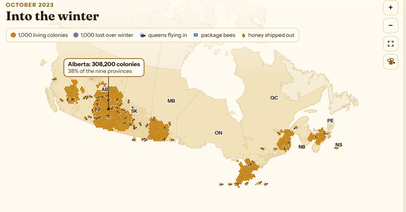
Canadian Honey Bee Explorer: a map of Canada with honey bee colonies drawn as golden hexagons, about 1,000 colonies each, clustered in Alberta, Saskatchewan, Manitoba, Ontario, Quebec and the Maritimes. Alberta holds 308,200 colonies, 38% of the nine provinces.

SECTOR - AGRICULTURE

Canadian Honey Bee Explorer

854,653 colonies, a century of honey and every winter's losses since 2007, in four narrated stories with a map for each.

See the example

Toronto Grid Pulse: every streetlight pole in Toronto as a glowing dot on the City's mapping, brightest downtown, with major roads labelled.

SECTOR - TRADE

Ontario Exports

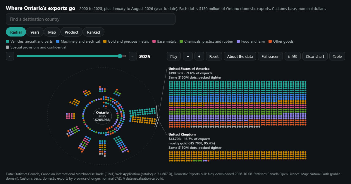
Ontario's domestic exports to 216 destinations since 2000. The US share fell from 93.2% to 71.6% as gold surged.

See the example

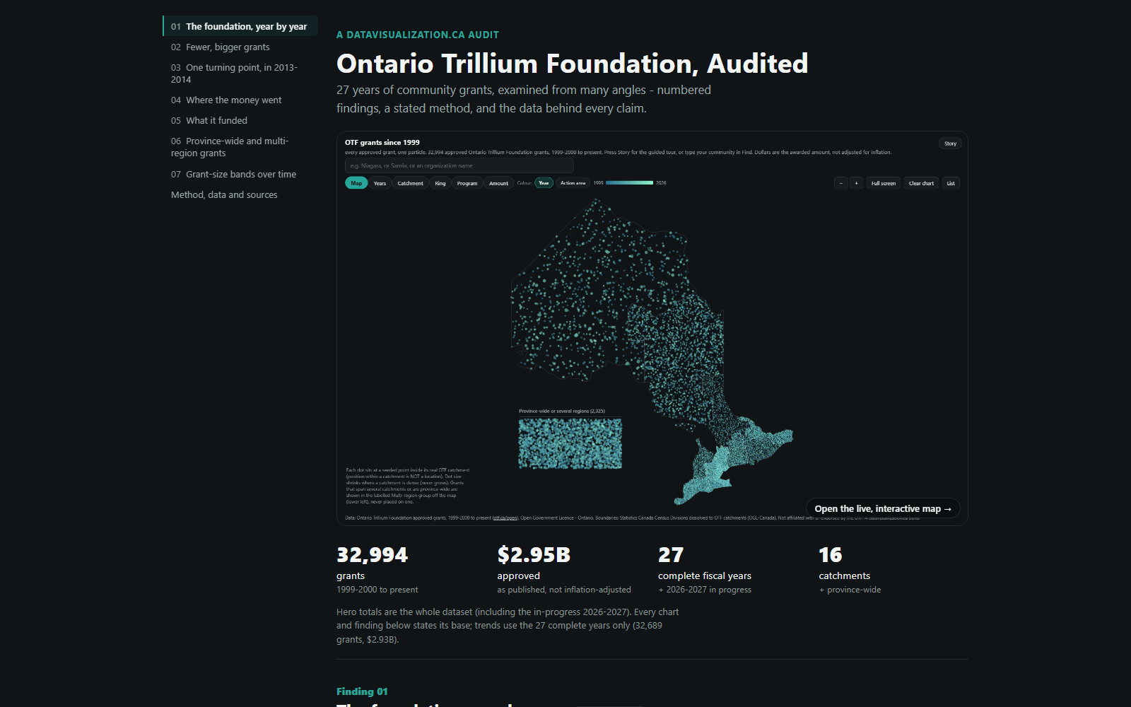
The audit page: the title Ontario Trillium Foundation, Audited, a map of Ontario made of one dot per grant, and four headline numbers: 32,994 grants, $2.95B approved, 27 complete fiscal years, 16 catchments.

SECTOR - FUNDING

Ontario Trillium Foundation, Audited

27 years of grants examined from every angle: seven numbered findings, a stated method and an inflation-adjusted view.

See the example

Map of Ontario made of dots, one for every Ontario Trillium Foundation grant since 1999, coloured by year. Southern Ontario is densest; 2,325 province-wide grants sit in a labelled group beside the map.

SECTOR - NONPROFITS

Ontario Community Grants

Every Ontario Trillium Foundation grant since 1999: 32,994 grants and $2.95 billion, one dot each.

See the example

YOUR DATA

Built from data you already gather

Your surveys and member records are a rich starting point, and public data adds the wider picture. If it fits in a spreadsheet, it can be visualized.

  • Member surveys
  • Salary and compensation studies
  • Membership records
  • Economic impact studies
  • Industry statistics
  • Conference and event data
  • Training and certification
  • Statistics Canada sector data
  • Government funding programs
  • Trade and export data

AODA / WCAG 2.1 AA

Accessible to every member, AODA included

Ontario's AODA requires private and nonprofit organizations with 50 or more employees to make their websites meet WCAG 2.0 Level AA. Every visualization we build meets WCAG 2.1 AA, a newer and stricter standard, so all of your members can use it, whatever your size.

Text table behind every chart

Every number can be read without the picture

Full keyboard access

Every control works without a mouse

Screen reader announcements

Changes are read out as people explore

Reduced motion respected

Animation can be paused or turned off

WCAG 2.1 AA on every build

WAYS TO WORK WITH US

Build, licence, or both

Every project is quoted after a discovery call. Here is how associations usually work with us.

Custom build

We design and build a visualization around your sector, your survey and your members, ready to embed on your site.

Licence

Use one of our ready-made visualizations with your own data and branding, on a monthly or yearly plan.

Build and licence

A custom build to start, then a licence that keeps it hosted and refreshed each time a new survey closes.

HOW IT WORKS

From first call to member launch

1

Discovery call

Tell us what your members and decision makers need to understand. We suggest what the experience could look like.

2

Scope and quote

We review the data, check what it can honestly show and protect member privacy, then send you a quote.

3

Build and review

You see a working draft early, and we refine it with your staff or committee.

4

Launch and update

It goes live for members or the public, and it can be refreshed with each new survey.

Questions associations ask us

Yes. Benchmarks are built from grouped results, so each member sees where they stand against peers without seeing anyone else's numbers.
Yes. We can build a public version for government and media and a fuller version for members behind your existing login.
No. Most projects start from a survey export or spreadsheet. We clean, check and document it, and we never fill gaps with made-up numbers.
Yes. We set each build up so a new year of survey results can be added and the visualization refreshed.
Every project is quoted. The price depends on the size and condition of your data, the number of views, and features like maps, tours or downloadable reports. See what affects pricing, or book a discovery call for a quote.

Turn your industry report into something members use

Tell us about your members and the data you collect. We will show you what an interactive experience could look like and what it takes to build it.