Home Industries Utilities & Energy Companies

INDUSTRIES

Data Visualization for Utilities and Energy Companies

We turn infrastructure, demand and program data into interactive maps and charts that customers, regulators and communities can explore on their own.

THE CHALLENGE

Make your network something people understand

Utilities run on data: assets, demand, outages, capital projects, conservation programs and water or energy flows. Customers and regulators see it as rate filings, bill inserts and technical reports, so the value of the work stays invisible.

An interactive map or chart shows where your network is, how it is changing and why it matters, in a form customers and councils can explore themselves.

TODAY

  • Rate filings and reports as long PDFs
  • Infrastructure data only engineers can read
  • Customers calling to ask what is happening and when

WITH AN INTERACTIVE VISUALIZATION

  • Clear maps of your network and projects
  • Demand and usage that anyone can follow
  • Open to every customer, WCAG 2.1 AA

Questions customers and regulators ask

WHAT WE BUILD

What we build for utilities

Network and asset maps

Lines, stations, poles and pipes on a real map, with the details customers and planners ask about.

Demand and usage over time

Hourly, daily or seasonal demand animated, so peaks and conservation results are easy to see.

Capital project maps

Every project with its status, budget and timeline, so communities know what is coming.

Flow and resource viewers

Water, wind or energy flows animated on a real map, measured or modelled and labelled honestly.

Program uptake maps

Conservation, rebate and EV programs shown by neighbourhood or service area.

Branded regulatory reports

Staff download a branded PDF or PowerPoint of the exact view for a filing or council meeting.

LIVE EXAMPLES

See it working

Live examples built from real infrastructure and environmental data, including modelled flows labelled as modelled. Every number comes from the published source.
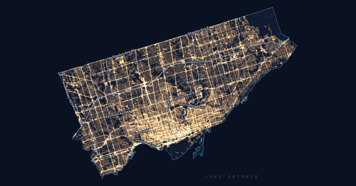
Toronto at night, each glow one of the City's 213,618 streetlight poles, brightest downtown, with major roads labelled.

UTILITIES - INFRASTRUCTURE

Toronto Grid Pulse

213,618 streetlight poles, 4,439 active development sites, 82 City-run chargers and 688,335 street trees on one real map of Toronto.

See the example

Toronto Grid Pulse: every streetlight pole in Toronto as a glowing dot on the City's mapping, brightest downtown, with major roads labelled.

ENERGY - HYDRO FLOWS

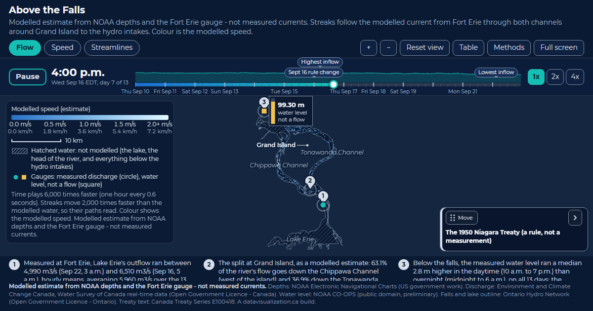
Above the Falls

Lake Erie's water around Grand Island to the hydro intakes. Modelled, 63.1% takes the Chippawa Channel; the published figure is about 60%.

See the example

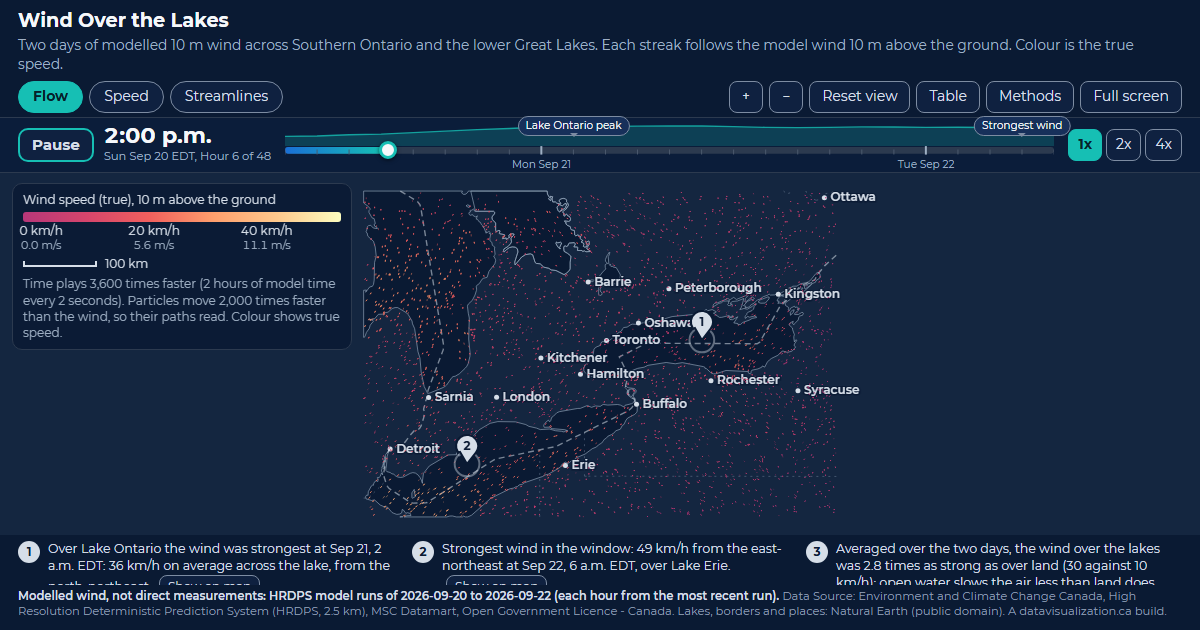
Wind Over the Lakes: Southern Ontario and the lower Great Lakes scattered with streaks that follow the modelled 10 m wind, coloured by speed.

ENERGY - WIND

Wind Over the Lakes

Two days of modelled wind over Southern Ontario and the lower Great Lakes, 2.8 times as strong over the lakes as over land.

See the example

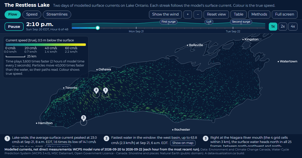
The Restless Lake: Lake Ontario filled with glowing streaks that follow the modelled surface current, coloured by speed.

WATER - SOURCE WATER

The Restless Lake

Two days of modelled surface currents on Lake Ontario. Every streak follows the current; the west basin peaks at 63.8 cm/s.

See the example

YOUR DATA

Built from data you already manage

Your GIS, SCADA summaries, billing aggregates and program records are a strong start. If it fits in a spreadsheet or a map layer, it can be visualized.

  • Asset and GIS layers
  • Hourly or daily demand
  • Outage history
  • Capital project lists
  • Conservation program uptake
  • EV charger locations
  • Water quality results
  • Generation by source
  • Service area boundaries
  • Weather and climate data

AODA / WCAG 2.1 AA

Ready for AODA from the first build

Ontario's AODA requires public sector organizations, and private organizations with 50 or more employees, to make their websites meet WCAG 2.0 Level AA. Every visualization we build meets WCAG 2.1 AA, a newer and stricter standard, so it can go on your customer site without a retrofit.

Text table behind every chart

Every number can be read without the picture

Full keyboard access

Every control works without a mouse

Screen reader announcements

Changes are read out as people explore

Reduced motion respected

Animation can be paused or turned off

WCAG 2.1 AA on every build

WAYS TO WORK WITH US

Build it, licence it, or both

Every project is quoted after a discovery call. These are the three ways utilities usually work with us.

Custom build

We design and build a visualization around your network, your data and your customers, ready to embed on your site.

Licence

Use one of our ready-made visualizations with your own data and branding, on a monthly or yearly plan.

Build and licence

A custom build to start, then a licence that keeps it hosted and refreshed as new data comes in.

HOW IT WORKS

From first call to go-live

1

Discovery call

Tell us who needs to understand your network and what data you have. We suggest what the experience could look like.

2

Scope and quote

We review the data, confirm what it can honestly show and what should stay private, and send you a quote.

3

Build and review

You see a working draft early, and we refine it with your team.

4

Launch and update

It goes live on your website and can be refreshed on a schedule that suits your data.

Questions utilities ask us

We agree up front what is public and what is not. Sensitive locations can be generalized, grouped or left out, and nothing is published without your sign-off.
Yes, and we label it clearly. Our Niagara and Lake Ontario examples show modelled flows next to the published figures they are checked against.
Yes. Where your data is published on a schedule, we set the visualization up to refresh, whether you update it yourself or have us do it.
Yes. Each visualization is a single web page that embeds on almost any website, and it can be shared with one link.
Every project is quoted. The price depends on the size and condition of your data, the number of views, and features like maps, tours or downloadable reports. See what affects pricing, or book a discovery call for a quote.

Show customers the work behind the bill

Tell us about your network and the data you manage. We will show you what an interactive map or chart could look like and what it takes to build it.